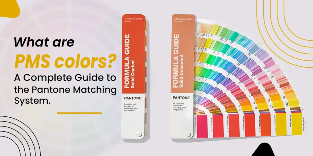
What is the PMS color? PMS color is a standard reproduction that allows manufacturers, printers, and designers to offer an exact matching of the color scheme without dependency on location or equipment.
Color consistency has become important in the era of printing, branding, and design. For instance, a brand with an inconsistent logo every time, like the darker or lighter shades. These inconsistencies affect brand identity and consumer trust. It led to the Pantone Machine System (PMS).
What are PMS Colors?
PMS colors are standard reproductions of color systems ideal for printing and graphic designing. It enables designers to specify ideal shades offering consistency across various materials and printers. Unique codes are used to identify these colors depending on brightness, saturation, and hue. This is how to define PMS color to ensure an ideal matching of color.
How Many Pantone Colors Are There?
Pantone Matching System (PMS) consists of more than 1,900 colors. These colors are available in different neon shades, pastels, metallics, and slides. It is important to consider that Pantone regularly updates the color library to reflect the latest materials and trends in different industries such as design and fashion.
What Is the Pantone Matching System (PMS)?
It is a standard color matching system created by Pantone LLC, a frontline entity in the color standards. This color system offers a catalog of ideal colors with a distinctive PMS code THAT helps printers and designers ensure ideal color consistency.
Every PMS color match includes a base pigment to ensure uniqueness for every shade. PMS color scheme is ideal for different industries such as design, plastic, textile, and printing. These are pre-mixed colors and printed without the need for several inks.
How are PMS Colors Different from Other Colors?
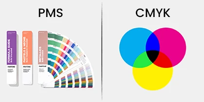
- PMS vs. CMYK: PMS Pantone utilizes pre-mixed inks, ensuring a precise and consistent color scheme for logos and offering an ideal consistency. CMYK colors are developed through the mixing of cyan, magenta, yellow, and black in different percentages to print complex designs and images without offering color consistency. Moreover, you convert CMYK to PMS colors.
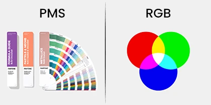
- PMS vs. RGB: PMS is an ideal choice for physical printing to highlight branding elements. RGB is a fantastic color option for digital displays and screens. You can convert RGB to a Pantone matching system.
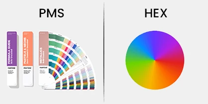
- PMS vs. HEX: PMS is suitable for physical products with excellent accuracy, while HEX is ideal for web design representing color schemes for digital screens.
You can take a look at the color guide CMYK and RGB to understand the major differences between PMS, RGB, and CMYK.
Why are PMS Colors Important for a Brand?
Brand Consistency
Brand identity is essential to build recognition and trust. A recognizable color scheme allows customers to identify your brand with uniformity.
Accurate Color Reproduction
You can easily replicate the desired hues and shades, allowing brands to follow strict color guidelines.
Expanded Color Options
The Pantone system consists of colors that can’t be achieved with CMYK such as fluorescents and metallics. You can use different shades with PMS to make your brand stand out.
How to Identify PMS Colors
PMS colors are based on different Pantone codes in formats such as “Pantone 1837 U” and “Pantone 186 C”.
- The Number: The numerical value of a code reveals the specific color in the system.
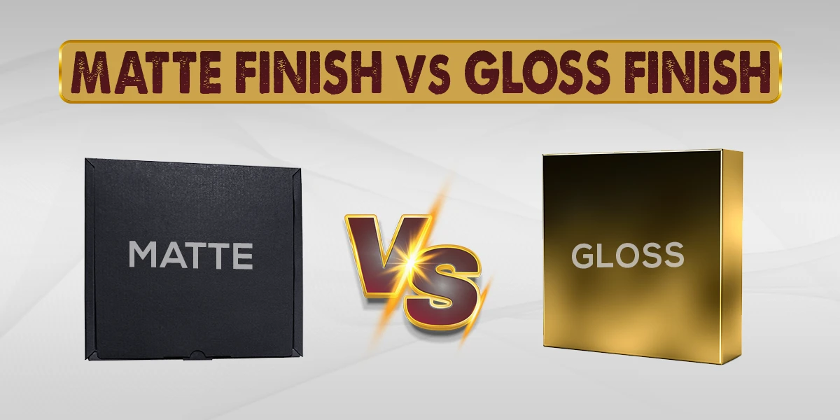
- The Letter Suffix: “U” and “C” convey “uncoated” and “coated” paper. The uncoated paper has a matte appearance, while coated paper includes a glossy finish, impacting the final look of the color.
Understand Pantone’s Color of the Year
A professional team of color experts chooses a “Color of the Year” based on the latest trends in fashion, art, and design. The selected color showcases the current cultural trends in different creative fields. For instance, “Viva Magenta” was announced as Pantone’s Color of the year 2023.
How to Utilize PMS Colors in Printing and Design
Use PMS in Digital Design
It is a print-oriented system and different design software tools such as Adobe Photoshop and Illustrator include Pantone libraries. Designers can select PMS colors within the software to align the colors of digital files with the printed files. It also becomes easy to custom package with a logo featuring PMS colors.
Choose PMS Colors for Printing
You can check your printer to confirm the matching of your desired PMS color schemes. Several commercial printers can handle PMS inks with CMYK printing ensuring an ideal combination of process and spot colors.
Match PMS Colors and Other Colors
Pantone matching system color chart allows you to match PMS colors to the closest RGB or CMYK colors. However, these conversions are not perfect for usage.
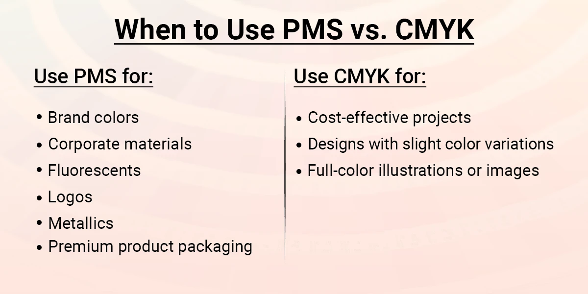
When to Use PMS vs. CMYK
Use PMS for:
- Brand colors
- Corporate materials
- Fluorescents
- Logos
- Metallics
- Premium product packaging
Use CMYK for:
- Cost-effective projects
- Designs with slight color variations
- Full-color illustrations or images
Benefits and Drawbacks of PMS Colors
Benefits
- Availability of distinctive shades such as fluorescents and metallics
- Consistent and precise brand color schemes
- Seamless color communication
Drawbacks
- Expensive color option
- Limited matching capability
How Does PMS Enhance Packaging?
PMS and Pantone are ideal for packaging to ensure a lasting impression while associating customers emotionally. Brands can ensure consistent packaging to reflect their branding color schemes. The distinctive and vibrant colors can differentiate your brand in a competitive market. For instance, a luxury skincare brand can prefer PMS metallic inks to ensure a fabulous finish to packaging offering a premium feel.
How to Find an Ideal PMS Color for Your Brand
- Assess Pantone Swatch Books: Books indicate the appearance of color schemes on various textile, uncoated, and coated materials.
- Collaborate with a Professional Designer: The collaboration with a qualified designer allows you to understand the interaction of colors with brand aesthetics and values.
- Test Print Samples: It is a good approach to print a few samples before starting a full production.
Consider PMS Colors to Enhance Branding
Do you want to differentiate your brand? Let’s invest in product packaging wholesale with PMS colors available at Silver Edge Packaging.

